THE BEAST IN ME
I had the pleasure of designing the winning concept and leading our team through to the final execution.
It was a typography nerd’s dream. The idea itself was simple, but that simplicity is what made it hit hard. Clean moves, strong type, bold presence… Not overdesigned, just confident. And that restraint is what gave it real impact.
8 bespoke title sequences, evolving each episode
I really wanted to reflect their relationship into the design. Starting from a more distant and controlled relationship to more intense, complicated and dirtier…
The designs get more intricate and the colors go ever so slightly get muddier with every episode.
THE PROCESS
After I read the scripts of the show, I kept coming back to the same idea: bookmaking.
The main character is a writer. She slowly pieces together her dark neighbor’s story to understand him and eventually write about him. That process felt a lot like designing a book. As graphic designers know, bookmaking is all about grids. You build structure first, then you play within it. Page by page.
I started thinking; what if we use that logic to reflect their relationship? Let typography and positioning do the storytelling.
When I was a design student, one of our first assignments was to tell a story using only 1x1 black squares. How do you show war? How do you show peace? It was all about spacing, rhythm, tension. That exercise came back to me immediately. I began experimenting with the distance between words, their weight, their balance, letting proximity and scale describe emotion.
Then we pushed it further. What if the layouts get more intense with each episode, just like their relationship? More tension. More compression. More complexity. That meant designing a lot of variations to land the right tone every time.
But no matter how far we pushed it, everything had to resolve into the exact same logo lockup at the end. That consistency mattered.
We also created bespoke animations and custom layouts for each chapter title. Even those small moments were opportunities to tell story. My favorite is Episode 7; when “Beast” subtly lingers behind the chapter name “Ghosts.” It’s a small detail, but it says everything.
I really wanted to create motion tests for the pitch because I knew static frames wouldn’t fully communicate the vision. The rhythm, the tension,
the pacing , that’s the idea. Without motion, it just wouldn’t land.
Coincidentally, that same day my coworker — shout out to David Rowley — shared a playlist with the team. On it was The Unanswered Question. It completely stopped me. I knew instantly that was the tone.
I dove into the work of Leonard Bernstein and Charles Ives, searching for something eerie but beautiful. Suspenseful. Moody. Something that gives you goosebumps without feeling obvious.
I ended up building three motion tests using The Unanswered Question, Tone Roads No. 1, and Tone Roads No. 3, laying them out as if they were three episodes.
These little motion tests really impressed the client, it gave them ideas. Then we started working with their composer and editor. It was a true collaboration.
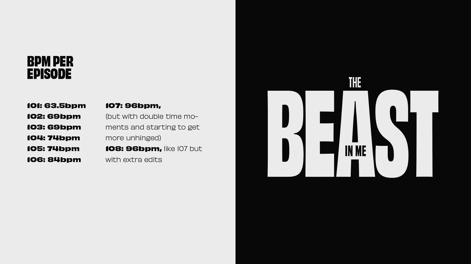
The music, though, was taking longer to shape than the animation itself. So we changed the approach.
Instead of waiting on final edits, we divided each episode by BPM. We knew the music of the first episode so we started from there and increased the tempo animating to a metronome.
That shift helped a lot. It gave us structure. We could plan exactly how many layouts we needed per episode and map how their relationship evolved through pacing alone. The faster it got, the tighter the tension felt. The rhythm became part of the storytelling.
It wasn’t just about visuals anymore — it was about timing, restraint, and escalation.